
10,000 Degrees: Redesigning the Career Success Platform
Making career support more accessible for 10,000 Degrees’ students and alumni as they navigate their next steps.
Role: Lead UX Designer
Duration: 6 months (2022-2023)
Tools: Figma, Google Workspace, Zoom
Target Users: 10,000 Degrees college students & alumni
Why this project mattered
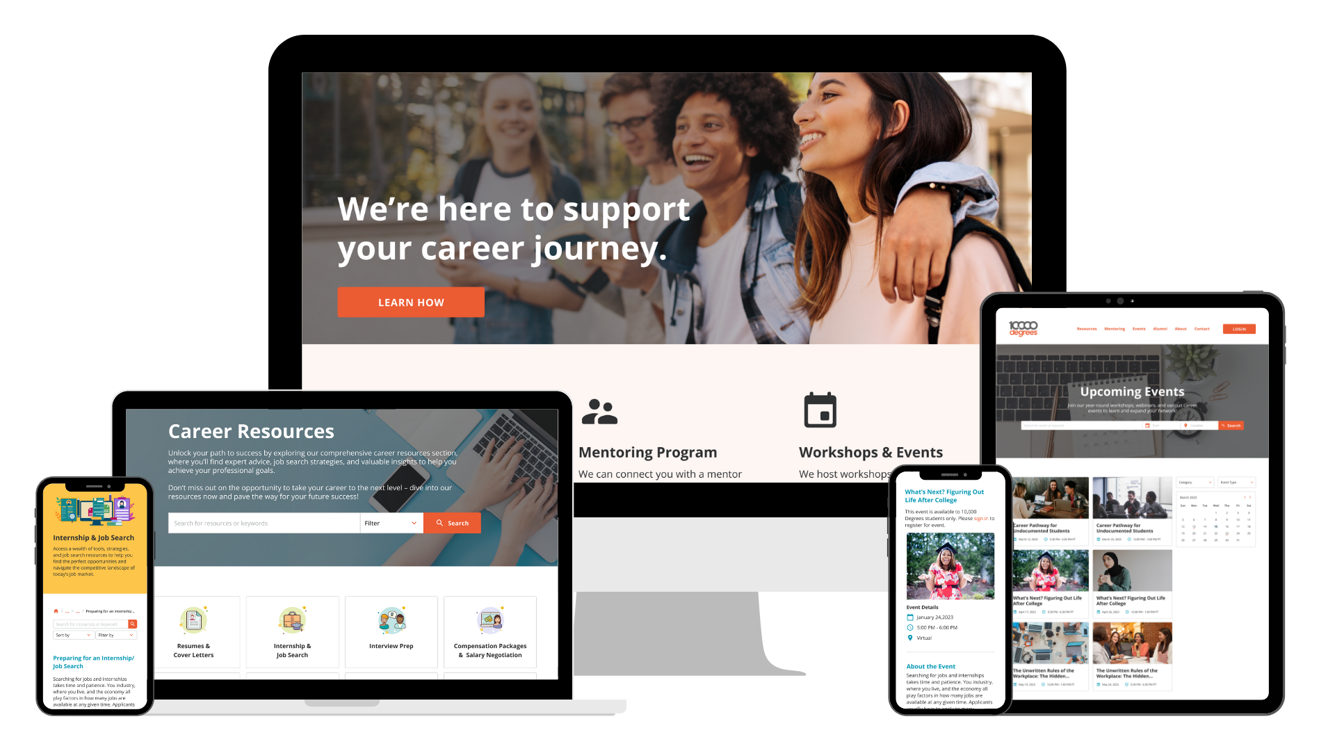
As part of its 5-Year Strategic Plan, 10,000 Degrees, a nonprofit organization dedicated to educational equity, aimed to enhance its Career Success Program. A core focus of the plan was transforming the outdated Internship website into a centralized, user-friendly platform to better support college students and alumni in their career journeys.
I led the end-to-end redesign in close partnership with the Career Success team, using student feedback to guide actionable design priorities that aligned business goals with user needs. The new site features an interactive resource library, an events calendar, and clearer support pathways, making it easier for students and alumni to discover relevant opportunities and guidance.
OVERVIEW
“Thanks for keeping the students front and center during the process and being so intentional about including their ideas and feedback…”
My Collaborators
Career Success
Primary Stakeholder (1)
Aligned design priorities with the Director of Career Success to meet program goals.

College Success
Subject Matter Experts (7+)
Partnered with college advisors to surface real user pain points and motivations.

Marketing & Communications
Integration partners (2)
Coordinated late-stage integration to ensure visual consistency and seamless alignment with the main site.
Why change was needed
The original Internship website hadn’t been updated since early 2022. Students and alumni—many of whom are first-generation college students—struggled to find internships, career guidance, and the right contacts for support.
Outdated content, poor accessibility, and a lack of visual engagement made the site difficult to use. Staff often shared resources via email or social media instead of directing users to the site, which limited its effectiveness and hindered students’ access to timely, relevant career support.
Key Issues:
THE PROBLEM
01
Accessibility Issues
Poor color contrast and dense layouts made the content difficult to read.
03
Outdated Information
Users encountered outdated staff listings and unclear points of contact.
02
Low Engagement
Text-heavy pages lacked visual elements, interactivity, and clear structure.
The color combinations used had contrast ratios below 1.5:1, failing to meet basic WCAG accessibility standards.
The resource pages were dense and overwhelming, making it difficult for users to engage with the content.
⁉️ Problem Statement
10,000 Degrees students and alumni struggled to find internships and career support through the Internship website due to outdated content and limited access to relevant resources, ultimately restricting their career development opportunities.
✨ How Might We
How might we redesign the Career Success website to make it easier for 10,000 Degrees students and alumni to access guidance and opportunities as they navigate their careers?
Where the experience was breaking down
To better understand the needs of students and alumni, I reviewed results from a large-scale interest survey (~500 responses) and conducted interviews with the College Success team, who serve as subject matter experts. Together, these methods revealed key gaps in accessibility, content formatting, and clarity of support.
RESEARCH & INSIGHTS
“I don’t like how there is only text in the resume, cover letter, and other resource pages. I believe it would be easier to digest if there were visuals or variety.”
Visual strain
12 users specifically mentioned visual strain due to poor color contrast.
Pain Points
Unclear support options
Outdated staff contact information and unclear listings led to confusion, especially for alumni.
Overwhelming content
Long blocks of text made it hard to scan or stay engaged.
Step-by-step structure
Students liked the homepage layout; they just wanted it to be easier to use.
Wants & Needs
Career events calendar
53% (265) wanted a career calendar to easily find networking and job search workshops.
Users preferred a mix of short videos and written content.
65% wanted both formats.
Grounding design decisions in real student and alumni experiences
To better align the design with real user needs, I created two lightweight personas based on insights from the interest survey (~500 responses) and conversations with the College Success team. These personas helped guide decisions around content structure, tone, and feature prioritization throughout the design process.
USER PERSONAS


DESIGN GOALS
Bringing the Vision to Life
Based on user research, I focused on improving three core areas that became the foundation for a more accessible, engaging, and student-centered platform.
Career Resource Library
Explored how to help students and alumni easily discover career resources tailored to their goals and learning preferences.

Event Calendar
Designed an accessible way for users to find and engage with upcoming events and workshops that support their career development.

Clearer Support Pathway
Explored ways to make it easier for students and alumni to identify and reach the right career support contacts.

CAREER RESOURCE LIBRARY
Making Career Support Easier to Find, Browse, and Use
The original resource pages were hard to scan, overly text-heavy, and not aligned with how students searched for support. I worked with the Career Success team to redesign the library into a modular, tagged system that made content easier to explore, maintain, and adapt to student needs.
Collaborative Exploration
The Career Success team brought an initial idea inspired by Immigrant Rising. They wanted something visual, intuitive, and easy for students to navigate. We worked together to brainstorm how to bring this to life in a way that was both user-centered and easy to maintain over time.
I proposed adapting the Step-by-Step Guide layout from the previous site—a format students had already responded positively to. Together, we explored options like keyword tagging, content categories, and modular blocks, then refined the direction based on usability goals and technical constraints.
Early Layout Concept
Reference site provided by Career Success, praised for its clarity and structure.
Early layout exploring category-based, modular content inspired by student feedback.
Content Strategy & Interaction Design
To improve discoverability and reduce cognitive load, I organized resources into three clear content categories: text-based guides, short video content, and vetted external articles. This structure aligned with user preferences from the interest survey and also supported 10,000 Degrees’ desire to feature multimedia and community-sourced content.
The tagging system and breadcrumb navigation were introduced to support clarity and choice. Students could filter content based on their goals while also being aware of their current location on the site.
Since there was no assigned developer on this project, I consulted with a peer developer to check the feasibility of the tagging and filtering system. My goal was to ensure that the design could be realistically implemented and maintained over time, even with limited technical resources.
Making Career Resources Easier to Explore
Career Resource Details
Hi-Fidelity Designs


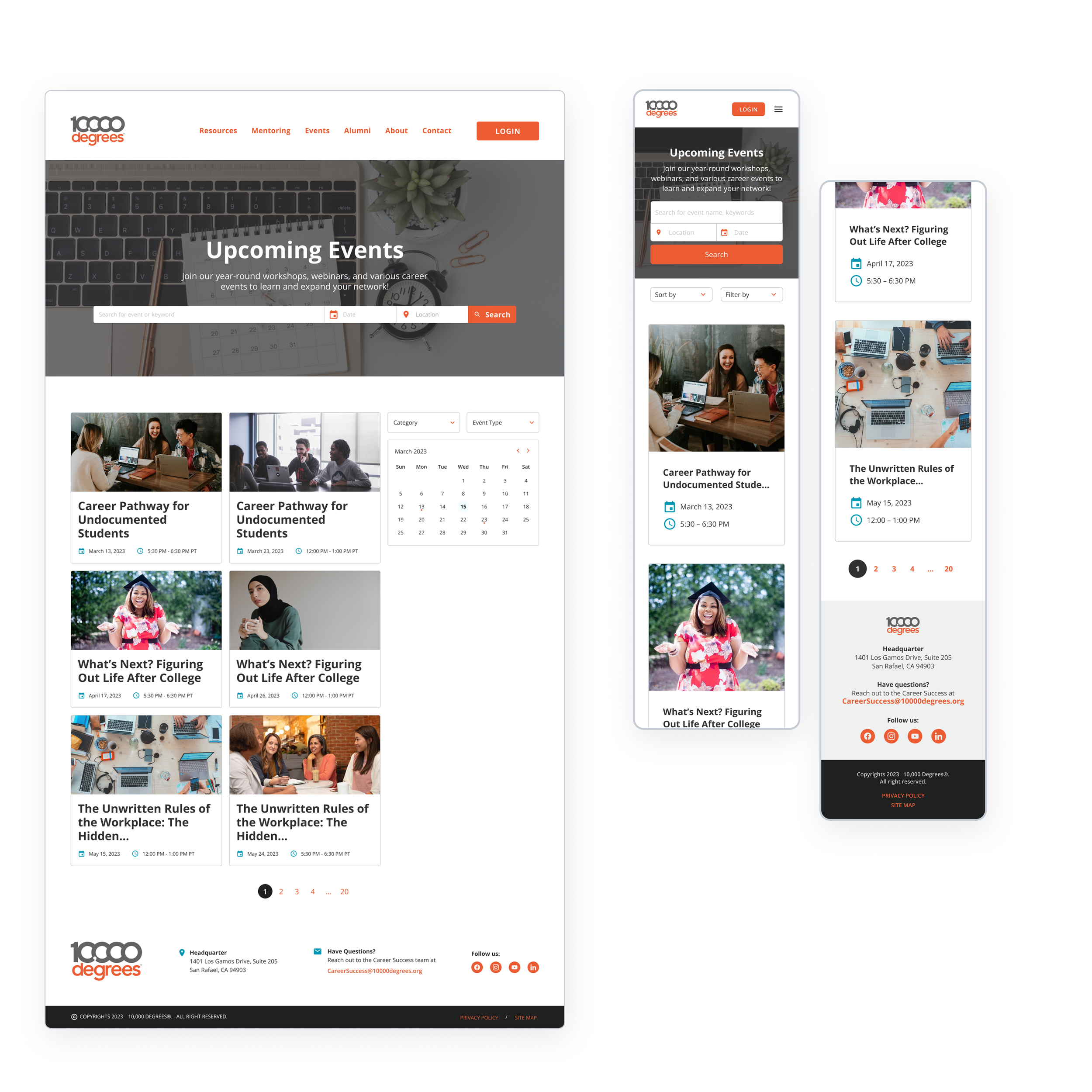
EVENTS & WORKSHOPS
Brainstorming and testing design ideas to make the Event Calendar more user-friendly and accessible
Users reported that the existing event calendar, located on the main 10,000 Degrees website, was challenging to use and poorly organized. The Internship site lacked a calendar of its own, which made it more difficult for students and alumni to find relevant workshops and events.
To address this, I explored several layout ideas and shared them with the College Success and Career Success teams. Their feedback helped shape a direction that prioritized usability, clarity, and alignment with program goals.
Exploration & Stakeholder Feedback
I explored a few layout options and presented them to the College Success and Career Success teams. These included designs with a featured calendar alongside upcoming events, and others that prioritized upcoming events more prominently.
01
Displaying Upcoming Events by Month
Early concept featuring a prominent calendar with upcoming events on the side—designed to help students and alumni view all events at a glance by month.
‼️ Career Success expressed concern about months with no events.
02
Displaying All Upcoming Events
A layout that highlights upcoming events first. This version was preferred by both teams, although there were some concerns about empty months on the calendar.
🌟 Both teams preferred this version. Although they liked having a calendar on the page.
⚠️ 10,000 Degrees’ Dilemma
There was internal hesitation about showcasing events on a public page since most events and workshops were reserved for students and alumni. Career Success worried about overexposing content meant to stay private, but also felt that omitting events entirely would underrepresent the work they do.
Iterations & Design Decisions
Based on stakeholder feedback, I refined the layout to prioritize upcoming events while maintaining calendar accessibility on the same page.
In the mid-fidelity version, I began working through event categories, access indicators, and content visibility. I also explored how to distinguish public content from login-gated information. Sketches helped me think through event detail hierarchy, visibility logic, and related content placement.
Browsing Upcoming Events
Career Resource Details
Event Detail Page
Hi-Fidelity Designs

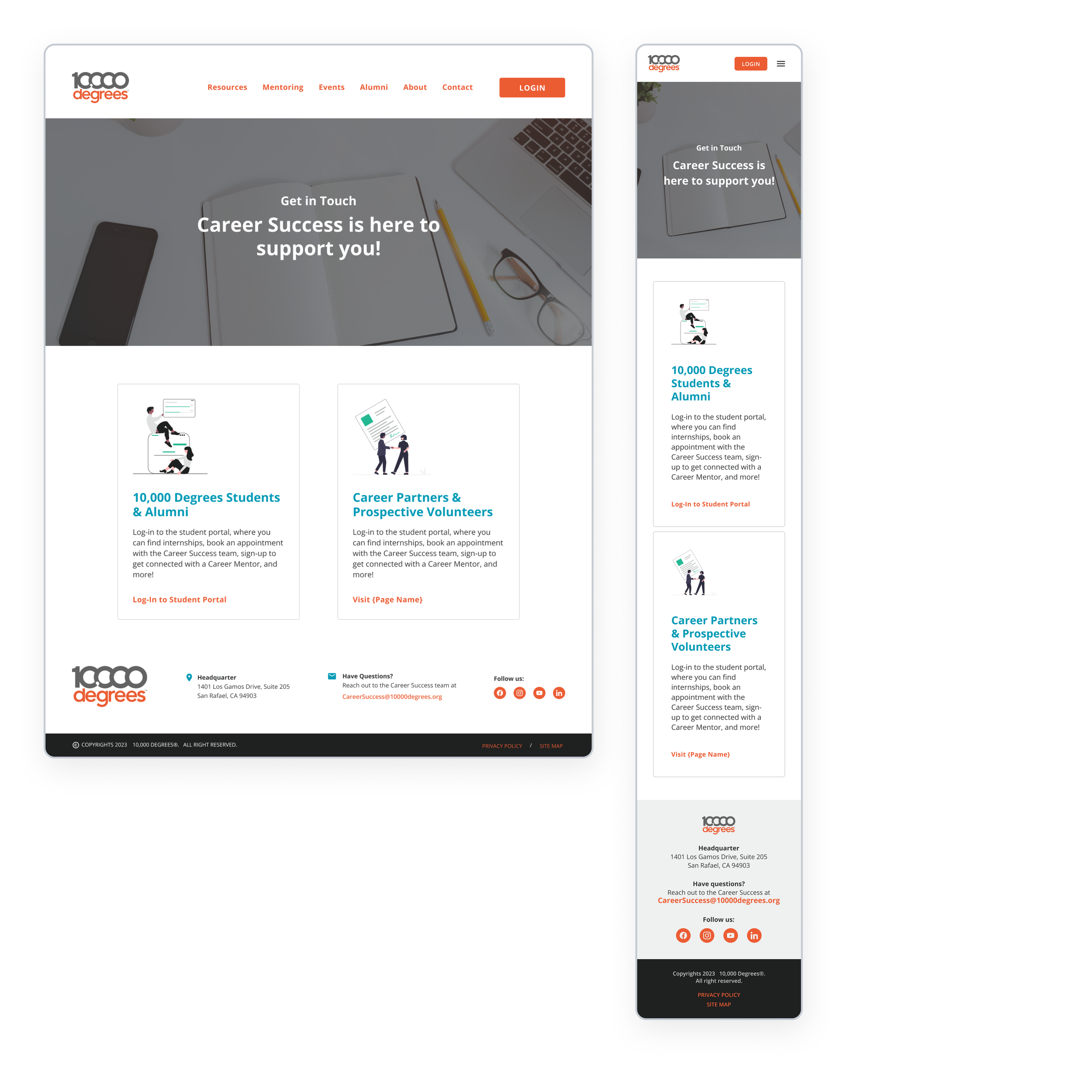
SUPPORT CONTACT EXPERIENCE
Clarifying support pathways for students and alumni
One of the core user pain points was not knowing who to contact for career support, especially when faced with outdated staff listings and unclear points of contact. I explored several design solutions to simplify this experience, including a dynamic About page, a simplified contact form, and a dual-path navigation for multiple audiences.
While the Contact and About pages were ultimately de-scoped due to site integration, some elements, like the point of contact, were retained in specific areas of the final site.
Discovery & Early Explorations
Through research and interviews with SMEs, I learned that students and alumni often encountered outdated staff listings and were unsure who to contact for help. I explored multiple ways to clearly and consistently surface support information, including adding a general email address to the site footer, drafting a staff-based About page, and collaborating with Career Success to create a simplified contact form.
About Page
Contact Page
Iterations & Design Decisions
As we further explored the Contact page, Career Success highlighted the need to serve a secondary audience: potential volunteers and partners. I proposed a dual-path card layout:
One for students and alumni, directing them to the Student Portal
One for external visitors, pointing them to a dedicated page on the main site
This design provided users with clarity while aligning with the organization’s evolving content strategy.
Revised About Page

Revised Contact Page
Hi-Fidelity Designs

CHALLENGES & CONSTRAINTS
Navigating shifting goals, limits, and decisions
This project involved shifting requirements, evolving priorities, and the absence of a dedicated developer, which meant designing adaptable, scalable solutions that could flex with the organization’s needs.
🔄 Changing scope
Midway through the project, the Marketing team decided to integrate Career Success into the main 10,000 Degrees website. This meant adjusting layouts, visual language, and feature scope to align with broader site constraints.
🤝 Cross-team alignment
I collaborated with Career Success (primary stakeholders), College Success (subject matter experts), and Marketing (integration partners).
Each team had different priorities and perspectives, so I had to consistently realign on goals while maintaining a cohesive user experience.
🛠️ No assigned developer
Since there wasn’t a developer on the project, I designed everything to work with no-code or low-code tools. I also consulted with a developer peer to confirm that features such as tagging, filtering, and access gating were feasible within the existing resources.
✂️ De-scoped features
Several planned pages, including Contact, About, and Alumni Stories, were removed from the scope to streamline implementation.
I worked closely with Career Success on the Contact and About pages before they were dropped, and repurposed those insights to improve team visibility and surface support information across related pages.
Alumni Stories was wireframed but ultimately deprioritized to focus the MVP on core content and functionality.
OUTCOMES & LEARNINGS
Measuring impact, adapting along the way
With stakeholder approval, the final designs were handed off for implementation. While some visual elements were later adjusted to align with new branding, the core UX structure, including the reorganized resource library and event calendar, remained intact.
💭 Next Steps:
Although I wasn’t able to conduct usability testing post-launch, it’s something I would have loved to do. Validating the navigation, tagging system, and resource layout with real users would have helped uncover additional opportunities to refine the experience.
What people say
“Wow, we could not have put together our vision for the new career success site without you. You were so generous to spend time walking us through the process, sharing design ideas, and creating a beautiful website prototype!
Thanks for keeping the students front and center during the process and being so intentional about including their ideas and feedback into the process. Also thank you for for being an all around amazing colleague and collaborator!
I am truly in awe of your design skills and am so appreciative of you taking on this project and going above and beyond!”
—ANN S.
Director of Career Success
“Thank you so much for your hard work on the new career website. I appreciate you and what you've done for the career team!”
—SAGA S.
Career Success Manager
“Thank you so much for your fantastic design of the new career website. You put so much thought into each page.”
—CITLALLI C.
Career Success Coordinator
“You are a rockstar for being willing to work on this collective vision. I know how much intentional time you spent in making it a student-friendly website. I know that it was a great way for all of us to share ideas, and you were able to reel us into this beautiful end result.”
—KARLA S.
Director of 4-Year & Alumni Success
“Thank you for all your support with the Career Success website! Your work elevates us to such a professional level, and everything looks so beautiful. We appreciate you and are incredibly lucky to have you on our team!”
—TANIA R.
Director of Community College Success
“The career website is looking amazing and a huge part of it is because of your creativity and design skills! You have made the redesign process such a fun and inclusive process, so much intention has gone into getting it going. Your leadership shone through from start to finish, so proud of you and the project!”
—MARIA H.
Director of Curriculum & Engagement
“Thank you for taking on this website project and doing such an amazing job with it. We are so appreciative of your work!”
—MEGAN T.
Director of Corporate Engagement